


※角2・洋長3封筒は検討案
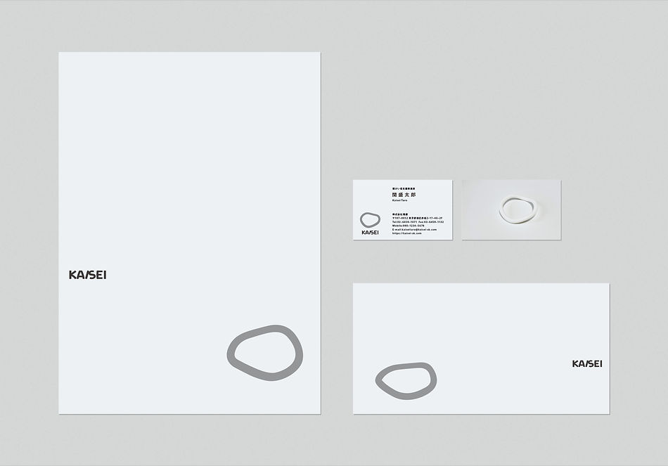
KAISEI
Category: Logomark
Date: 2022
Client: KAISEI
Kaisei Co., Ltd. is a company engaged in supporting employment for people with disabilities, and in anticipation of future business expansion, it has renewed its corporate identity (CI).
In the new CI, a three-dimensional form (symbolic object) was placed at the core, serving as the foundation of the company’s identity. The symbol mark is a graphic representation derived from this sculptural form.
The three-dimensional form is an abstract expression of “a person.” Depending on the angle and viewpoint, it reveals a variety of appearances. Its never-identical shapes symbolize the dignity of each individual and the diversity of values, embodying the worldview that Kaisei seeks to realize.
株式会社開盛は、障がい者の就労支援などを行う企業であり、今後の事業拡大を見据えてCIを刷新。
新しいCIでは、立体造形(シンボルオブジェクト)を軸に据え、企業アイデンティティをかたちづくることに試みた。この立体造形をグラフィック化したものが、シンボルマークとなっている。
立体造形は、抽象的に「人」を表現したもので、見る角度や視点の変化によって多様な形を見せる。同じ形が二つとないその姿は、一人ひとりの尊厳や多様な価値観を象徴し、開盛が目指す世界観を表している。